SHELL ENERGY
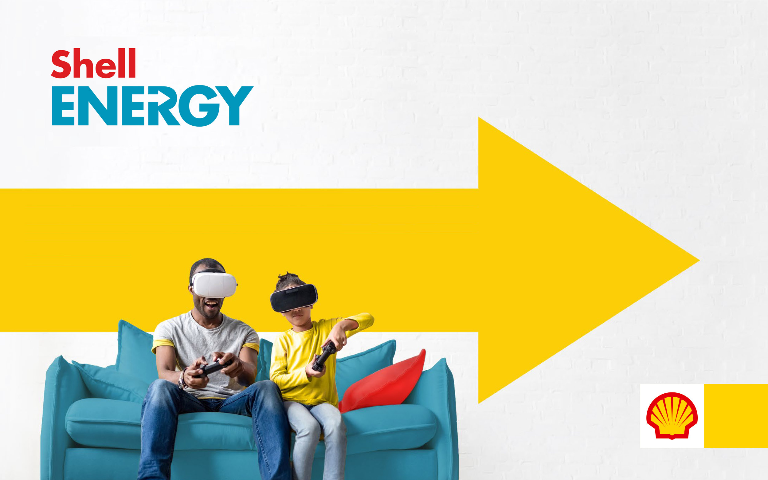
When Shell entered the household energy sector by acquiring a leading UK energy company, they approached us at Conran to create a forward looking brand that would reflect their cleaner energy ambitions and their vision of a more sustainable energy future. ©Conran Design Group.

Brand CVPs and architecture.

Once a conceptual ‘corridor‘ was established, a number of creative approaches were presented to the business to gauge what they felt best expressed their vision for their new brand.

Early mark development examples for Better Energy Future and Empowered Energy routes.

Colour, mark and imagery approach exploration.

The final logo expressing, boldly and simply, a Better Energy Future while aligning with Shell master brand’s strict design criteria for sub-brands.

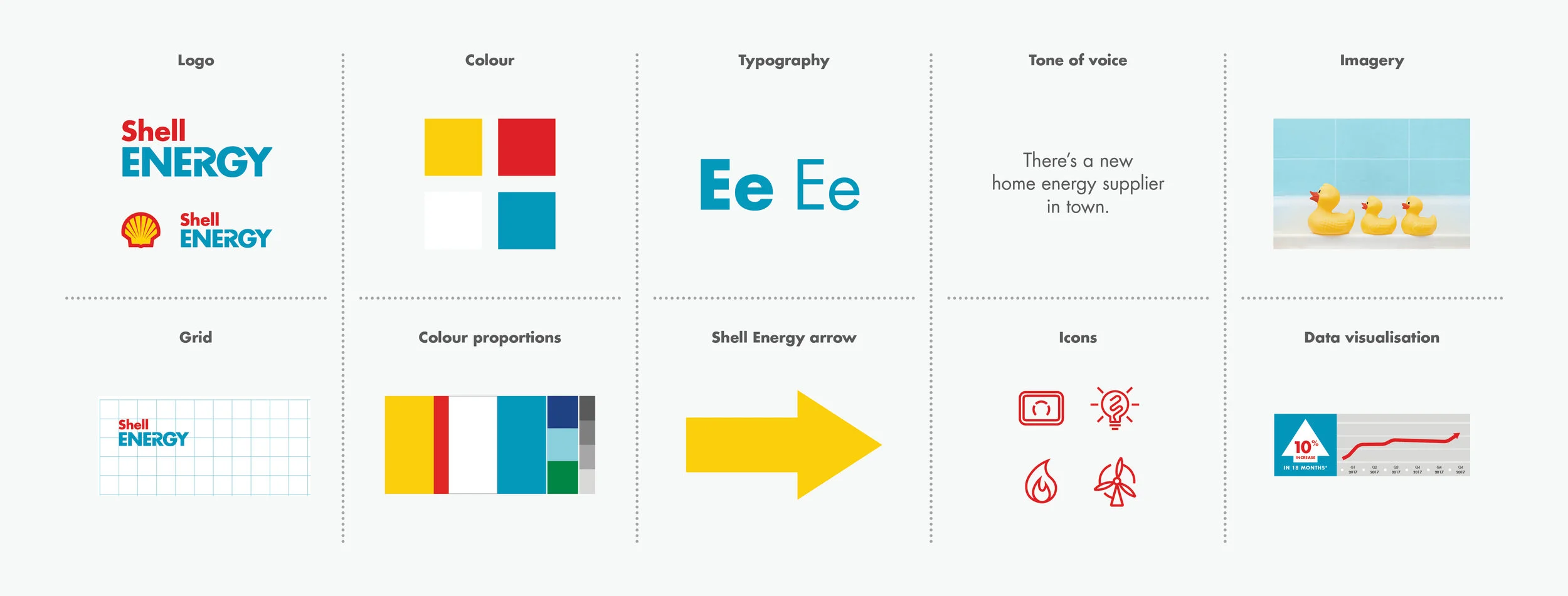
Visual language and TOV areas covered in the B2C brand guidelines.

B2C guideline pages.

Applications of the brand.

Illustration style.

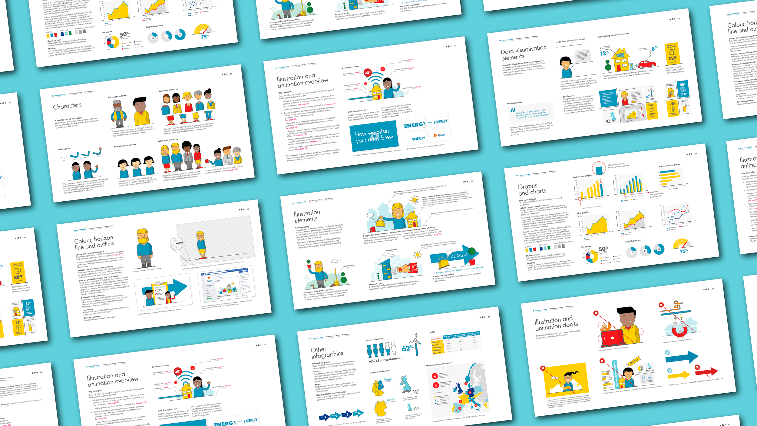
The illustration, animation and data visualisation style was developed to humanise the brand through an approachable and flexible system.

A modular system for characters was developed to simplify animation and be flexible enough to create a large variety of people for all markets.
Application of illustration.

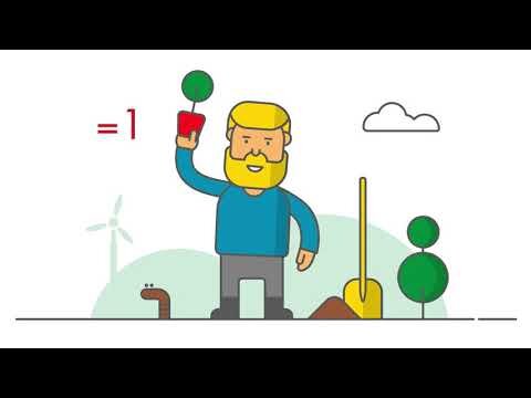
Animation testing.

We did a number of tests to see how the illustration would animate, how transitions between scenes would work and if scale change would work the way we had anticipated.

Guideline document for illustration, animation, and data visualisation.